Portfolio

Designs that
raise the bar

Creative software solutions that set the standard across multiple industries.

Your designs strike the perfect balance between form and function. Impressive work!

— Abir Mahmood

When this area has keyboard focus, use the Left and Right Arrow keys to move between highlights, Home to go to the first, and End to go to the last. You can also use the previous and next buttons.

Steam

  • App design

Steam is the most popular gaming platform, notorious for the pile of games people buy and never play. Our permissionless redesign empowers game collectors to become fans.

This looks amazing, and now I feel disappointed that the design isn’t like this.

— iiGiovanni
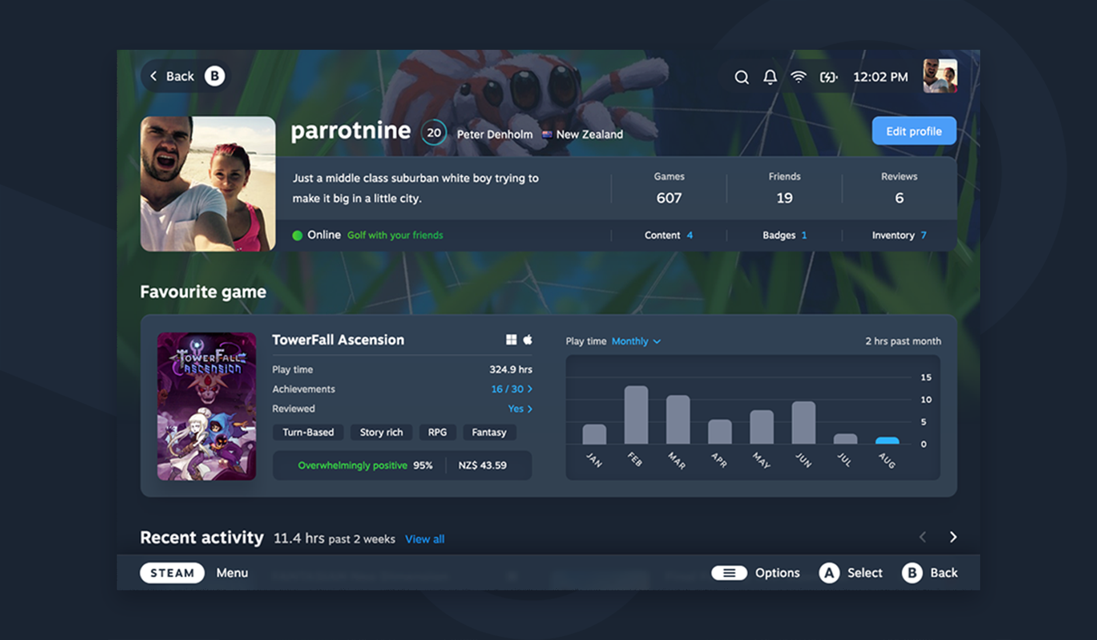
Steam profile after the redesign, with a compact profile summary above a favourite-game card showing achievements and a monthly play-time chart.
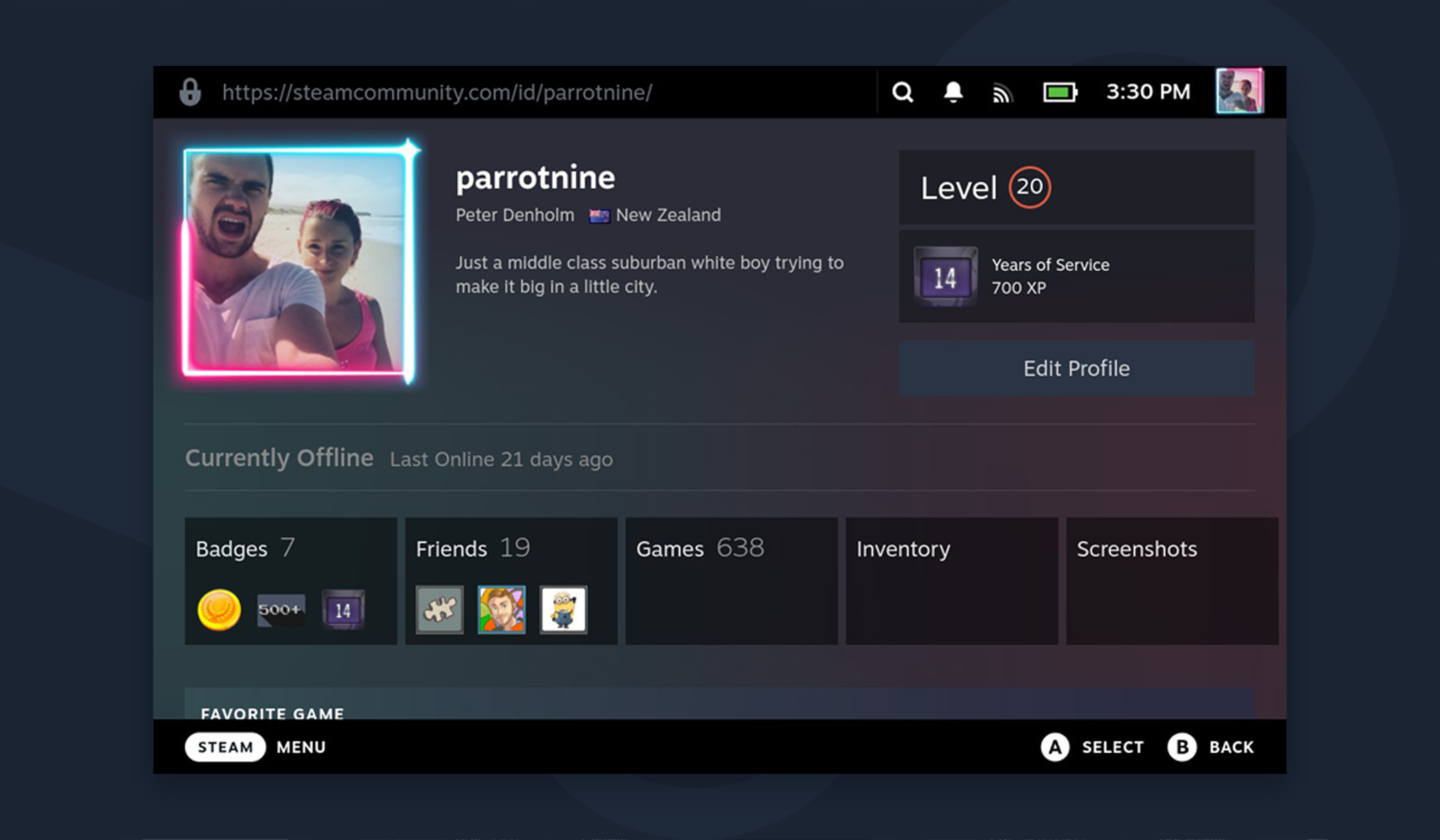
Steam profile before the redesign, with a large avatar and biography above separate panels for badges, friends, games, inventory and screenshots.
Before is on the left, after is on the right. Drag horizontally, tap anywhere on the image, or use the arrow keys. Move right to reveal more of the before image. Home shows the after image; End shows the before image.

The fundamental redesign

The Steam interface wastes space, it’s hard to read, and it hides information. To make it more engaging, we had to fix the foundations: information architecture, task flow, and presentation. The result of ruthless prioritisation, our design system balances information density with visual appeal for clarity at a glance.
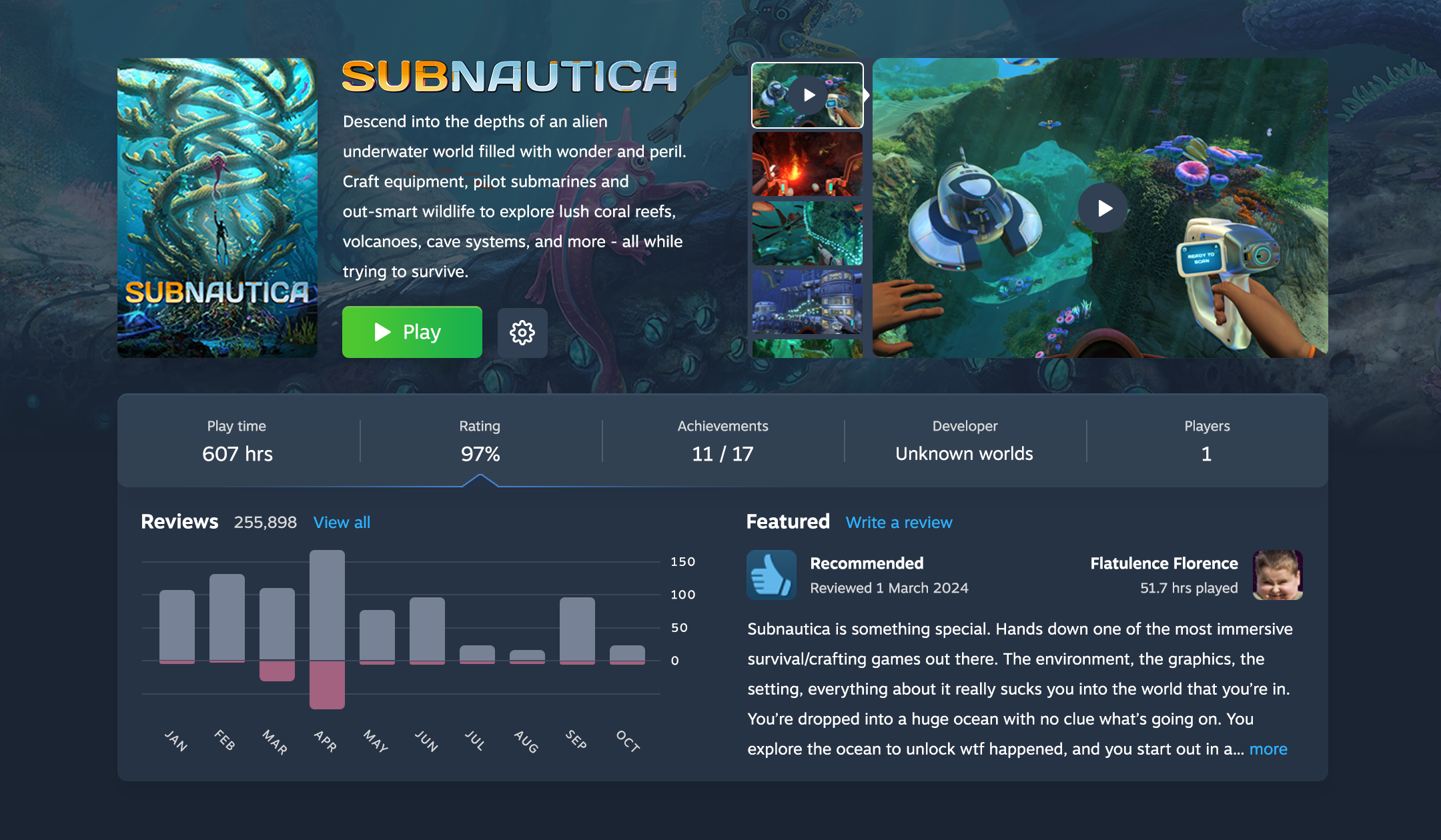
Redesigned Steam page for Subnautica, with a green Play button, media gallery, game statistics, review chart, and featured player review.

A game page that convinces you to play it

Steam gamers collect more games than they can play. Their attention is scarce, but games have no way to compete for it. Our game page reminds you why you bought it in the first place, and includes trivia, a contributor list, and other little details that transform you from a collector to a player to a fan.

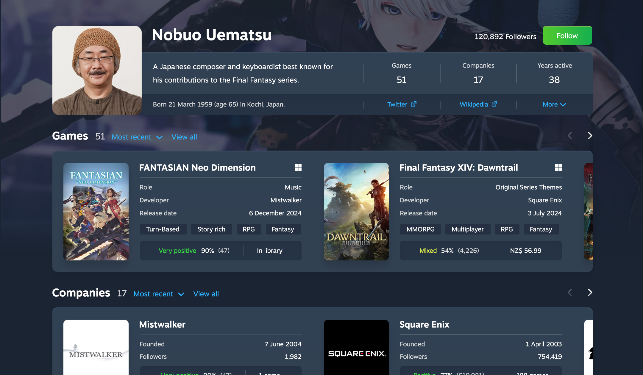
Steam contributor page with a portrait and biography above separate rows of game credits and associated company cards.

A discovery funnel with people at its core

If you enjoy a game, you want to know who made it and what else they’ve made. It’s not easy to explore through Steam. Inspired by Plex, we added a contributor section to each game and company page, and gave each person a page of their own. Jump from game to contributor to company to game and back again.

Balanced

  • App design
  • Web design
  • Branding
  • Marketing
  • Development
  • Documentation

Balanced challenges lazy crypto software with an interface even new investors can understand, and aggregates every finance feature worth using into a single app.

This has got to be the easiest, user friendly application I’ve ever had in cryptocurrency. Seriously. It’s like watching the internet evolve.

— @thisisselfmade
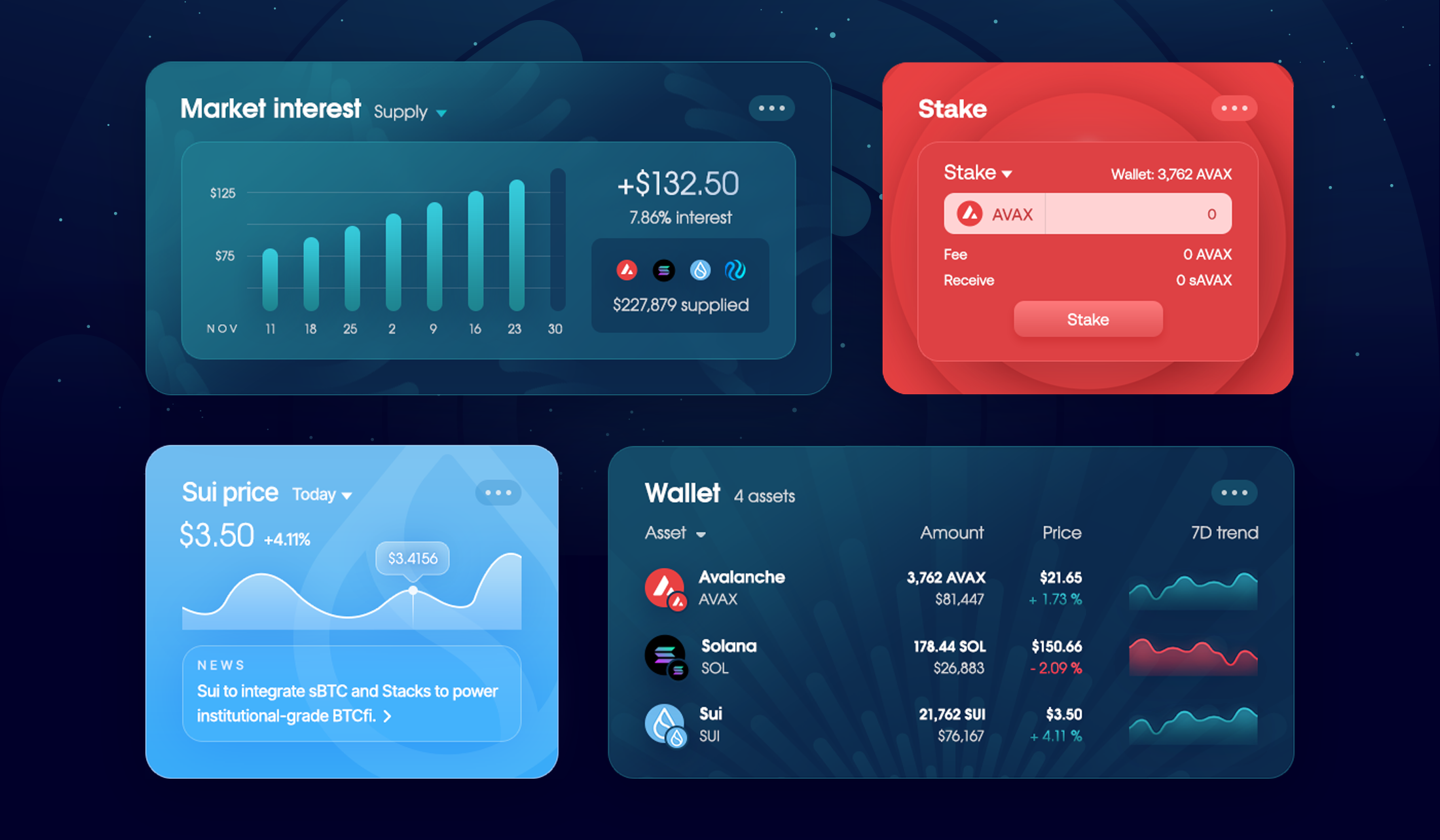
Four Balanced widgets: a market-interest bar chart, an AVAX staking form, a Sui price chart with news, and wallet balances with trend charts.

A design-focused widget catalogue

Crypto apps are hard to use, and you often need many. Portfolio, wallets, charts, exchanges, loans, and opportunities to earn. Balanced gives you access to everything from one place, with widgets that are easier to use and more customisable than the apps they represent.

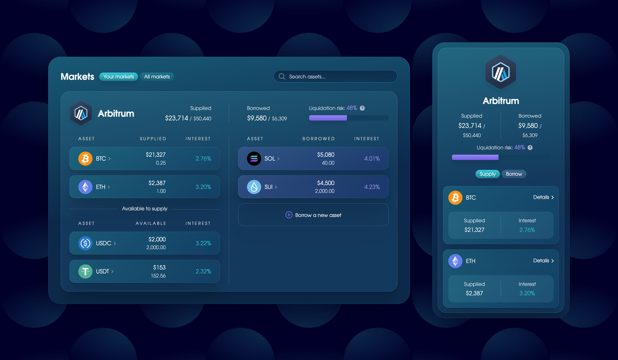
Balanced money market in desktop and mobile layouts, with supplied and borrowed assets, interest rates, and a liquidation risk bar.

A flexible money market layout

People use money markets to earn and borrow. Sounds simple, but it usually isn’t. The apps are complex, spread information across dozens of pages, and force you to use one blockchain at a time. We limited ours to a single page that helps you learn through action and even borrow across chains.

Case study: Designing a flexible money market

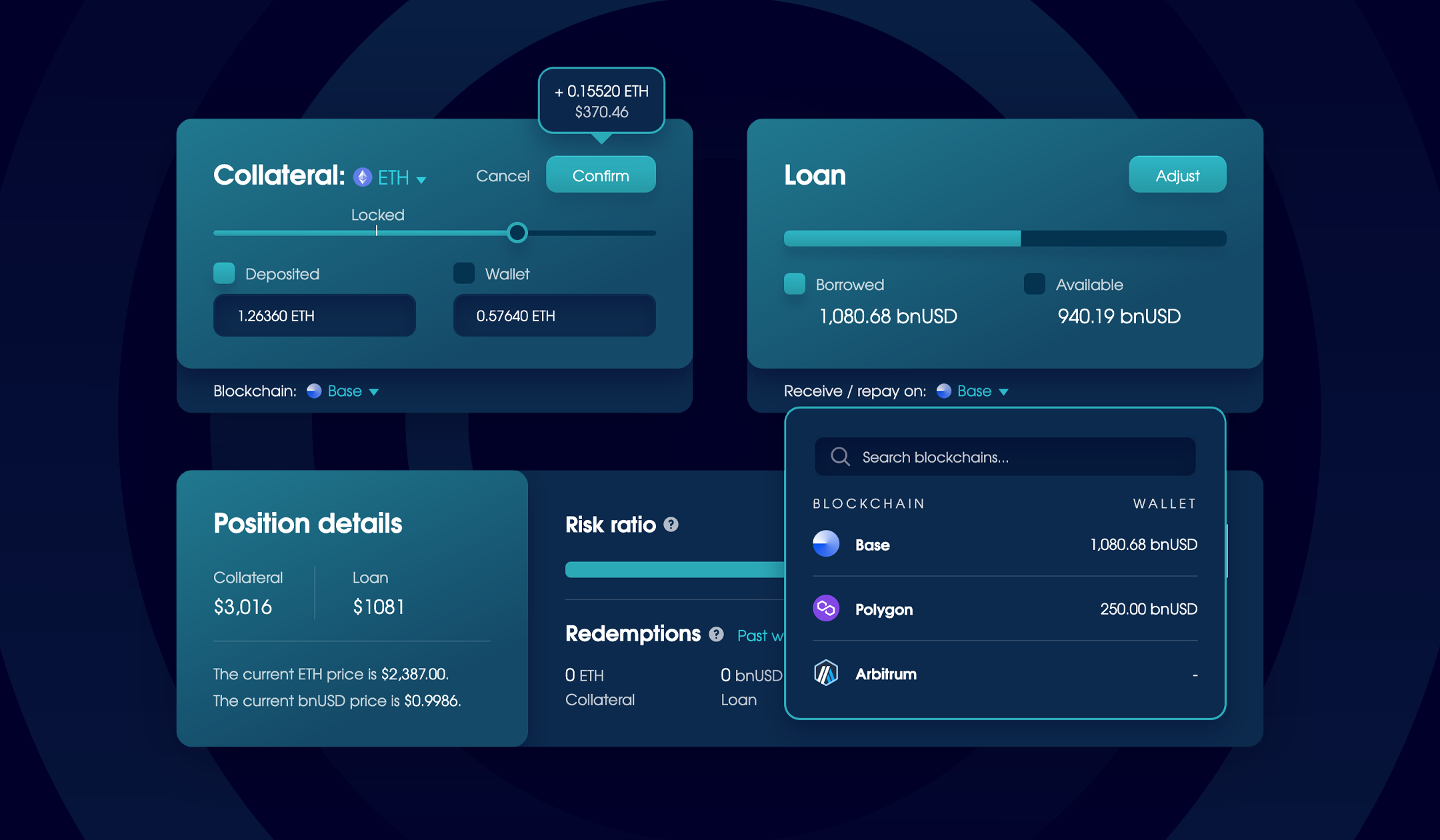
Balanced collateral and loan panels with separate blockchain selectors; the open loan menu lists Base, Polygon, and Arbitrum.

An interface you can extend without a redesign

We designed the Balanced loan for one blockchain. Three years later, it had to support many. We didn’t want to limit the app to one chain at a time or force people to relearn it, so we introduced panel-level blockchain selectors that built upon our existing design.

Case study: Pioneering the cross-chain loan

The first stablecoin loan that made sense

Balanced launched with a crypto loan for the bnUSD stablecoin. You had to keep your risk inside the reward range, avoid liquidation, and worry about rebalancing. We didn’t understand it until we added dynamic sliders that work like a calculator. Play with them for a moment, then everything clicks.

Case study: The making of Balanced

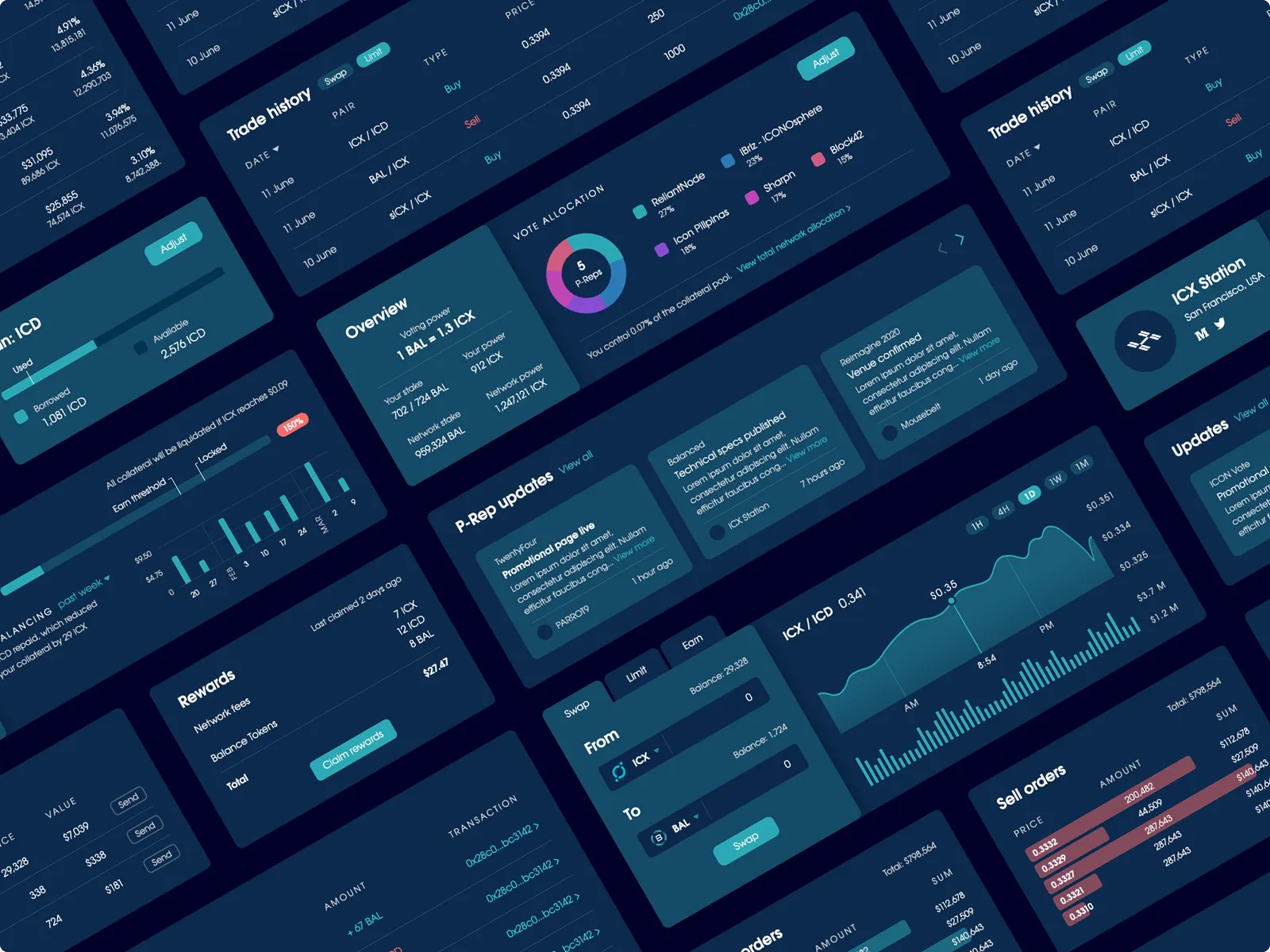
Angled collage of Balanced panels for trading, rewards, and vote allocation, using dark-blue cards, turquoise controls, and red sell indicators.

A cohesive ecosystem

Reusable patterns gave related products a shared character while leaving room for each service to communicate its own purpose.

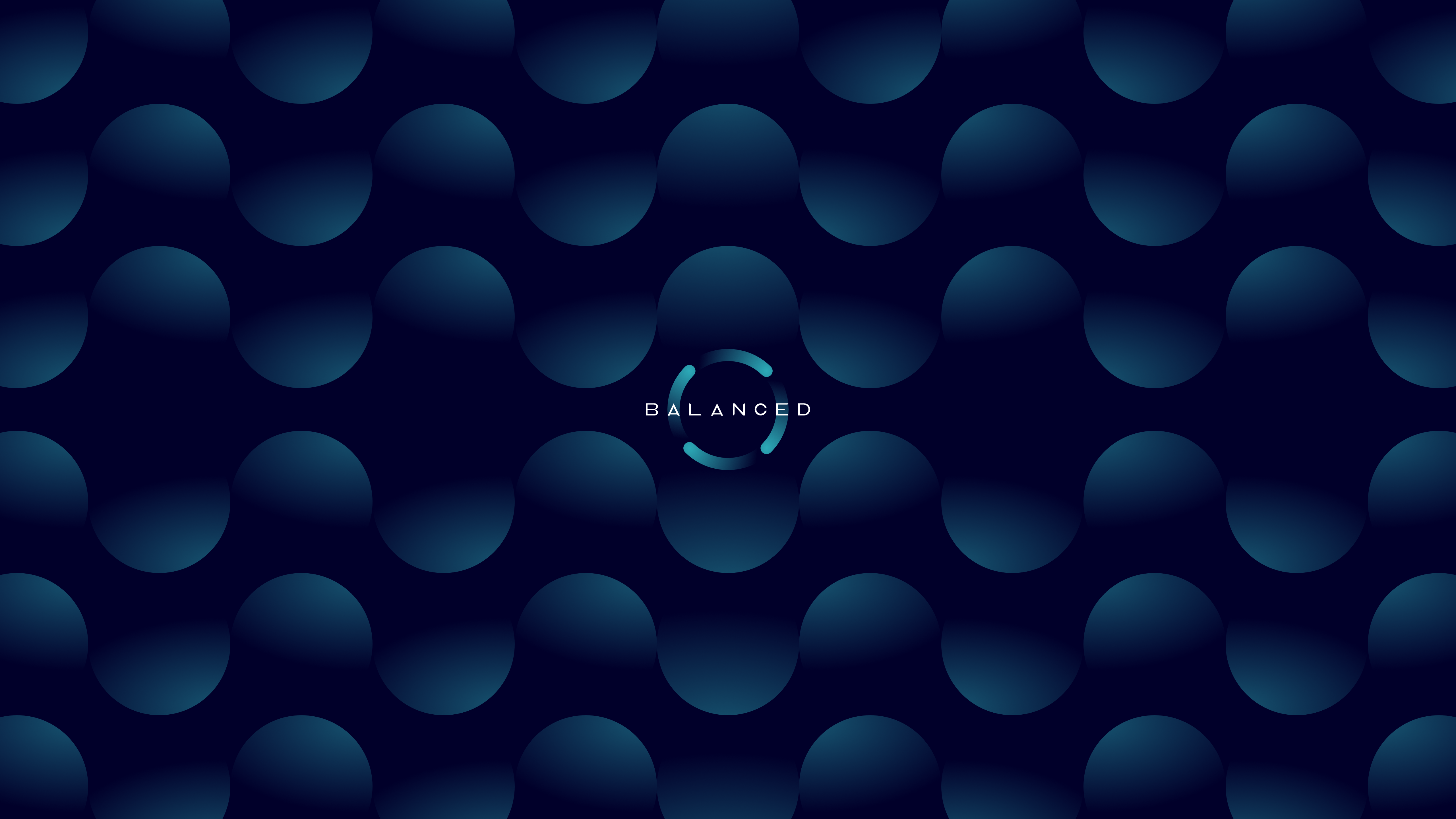
Balanced wordmark inside a segmented turquoise ring, centred on a navy background patterned with blue gradient circles.

Memeing the brand

ICON ecosystem

  • App design
  • Web design
  • Branding
  • Writing
  • Development

ICON was the core blockchain for Balanced and Omm until 2025. Its small audience limited their potential, so we designed an ecosystem to attract people with taste.

PARROT9 are next-level designers in their own league. WhyICX.com is the cleanest and most well put together landing page I’ve seen in this industry

— @benny_options
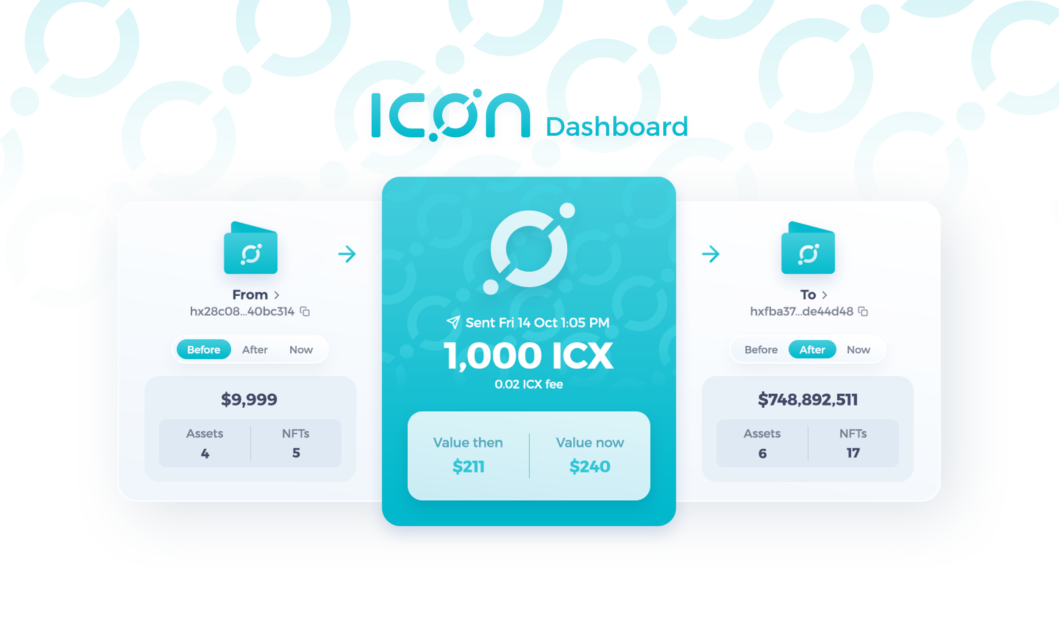
ICON Dashboard transaction view showing 1,000 ICX sent between two wallets, with the fee, value then and now, and wallet balances.

Transactions you can understand at a glance

When you verify a crypto transaction, you use a blockchain explorer. But they’re made for developers, so it’s often unclear what a transaction was for, how much money moved around, or where it went. Our transaction page makes the core details easy to scan with a bespoke design style for each asset and action.

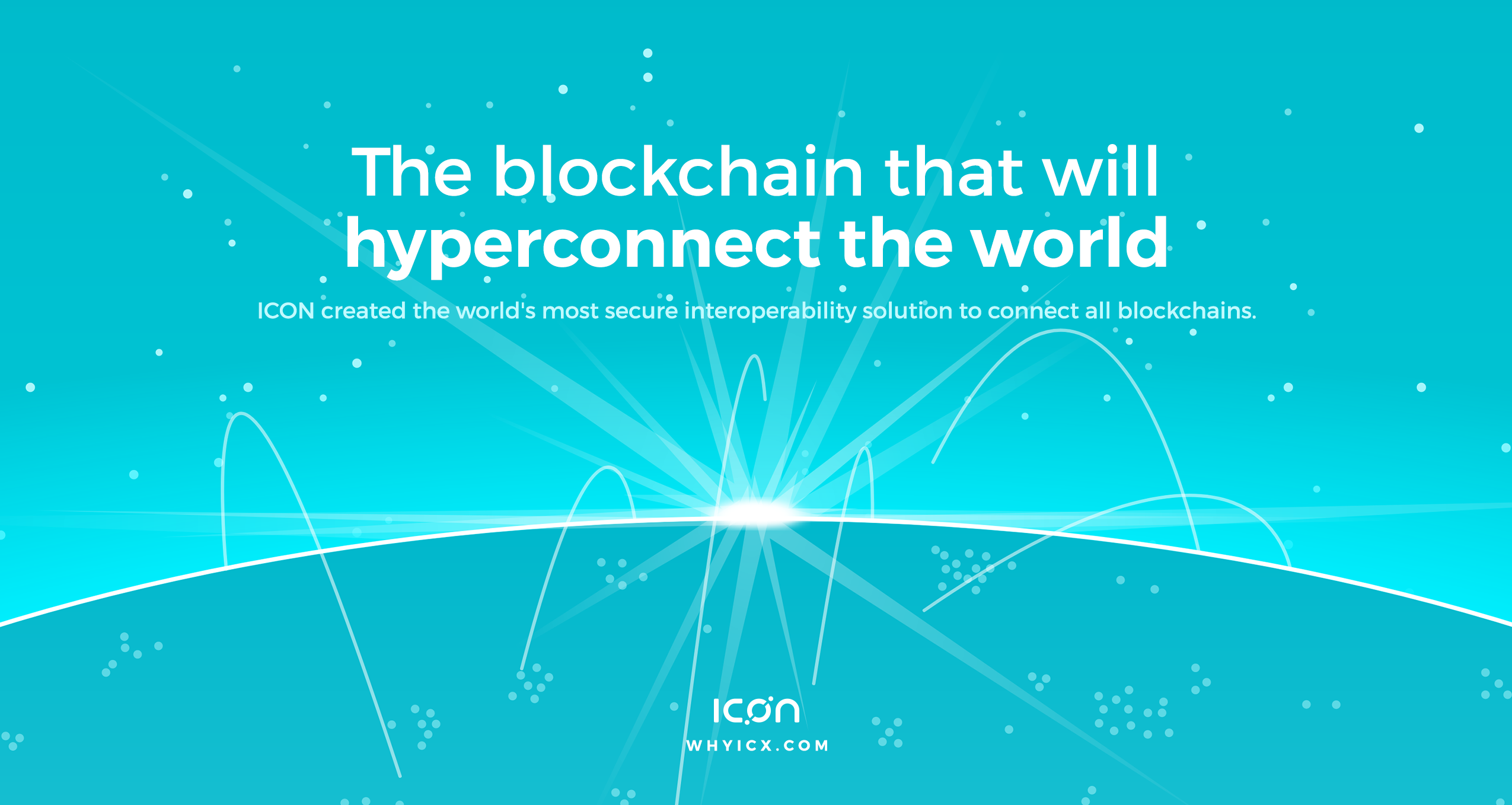
WhyICX hero artwork with the headline "The blockchain that will hyperconnect the world" above a turquoise globe connected by white arcs.

A marketing site people actually want to read

People read less than 20% of the words on a page, so crypto websites put zero effort into them. They act like every visitor is already an investor and skip the sales pitch. High-commitment actions need long-form content, so we created an educational site that gave people a reason to care about the ICON ecosystem.

Case study: How to design a blockchain website that converts

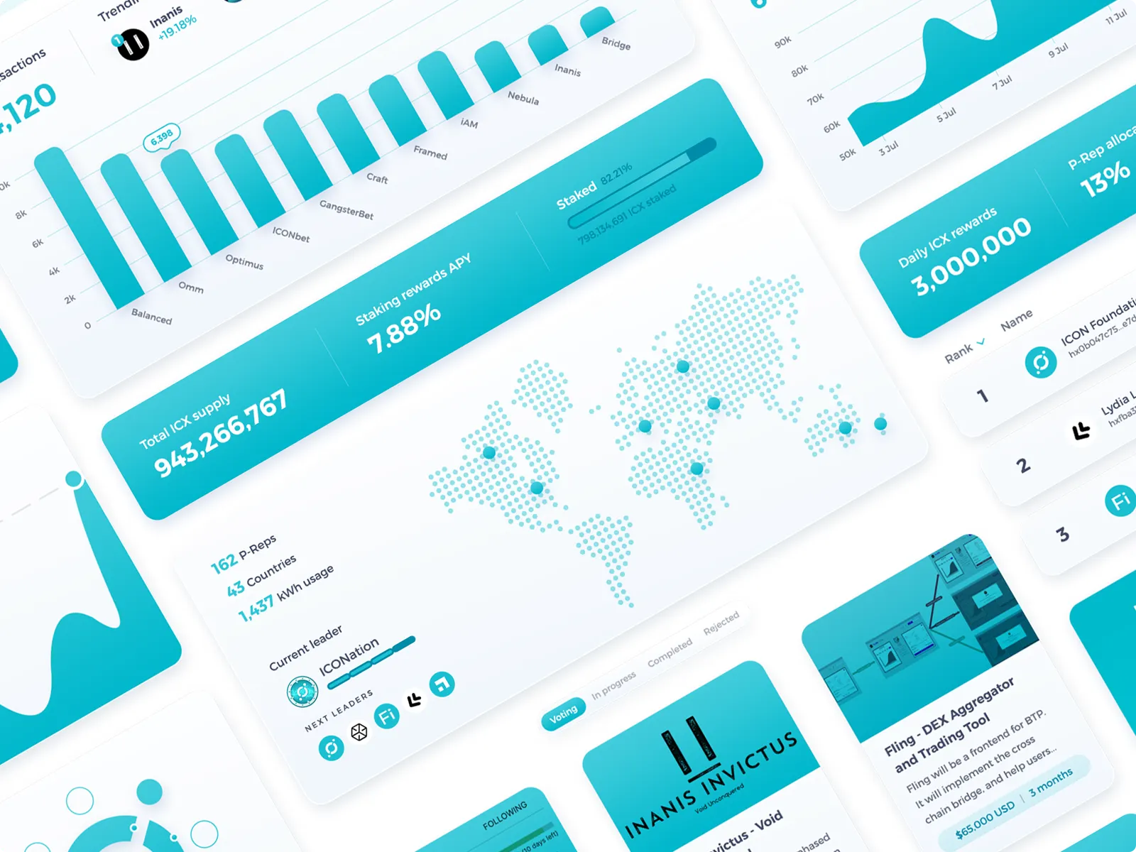
Angled collage of ICON interface panels, with white cards, turquoise charts, a dotted world map, network statistics, and project listings.

A brand that’s consistent across touchpoints

People have to encounter with your brand 7 times before they recognise it. If every touchpoint looks different, you don’t have a brand at all. We used the same colour balance across the WhyICX website, ICON Dashboard, and various app concepts to make sure every interaction felt as consistent as possible.

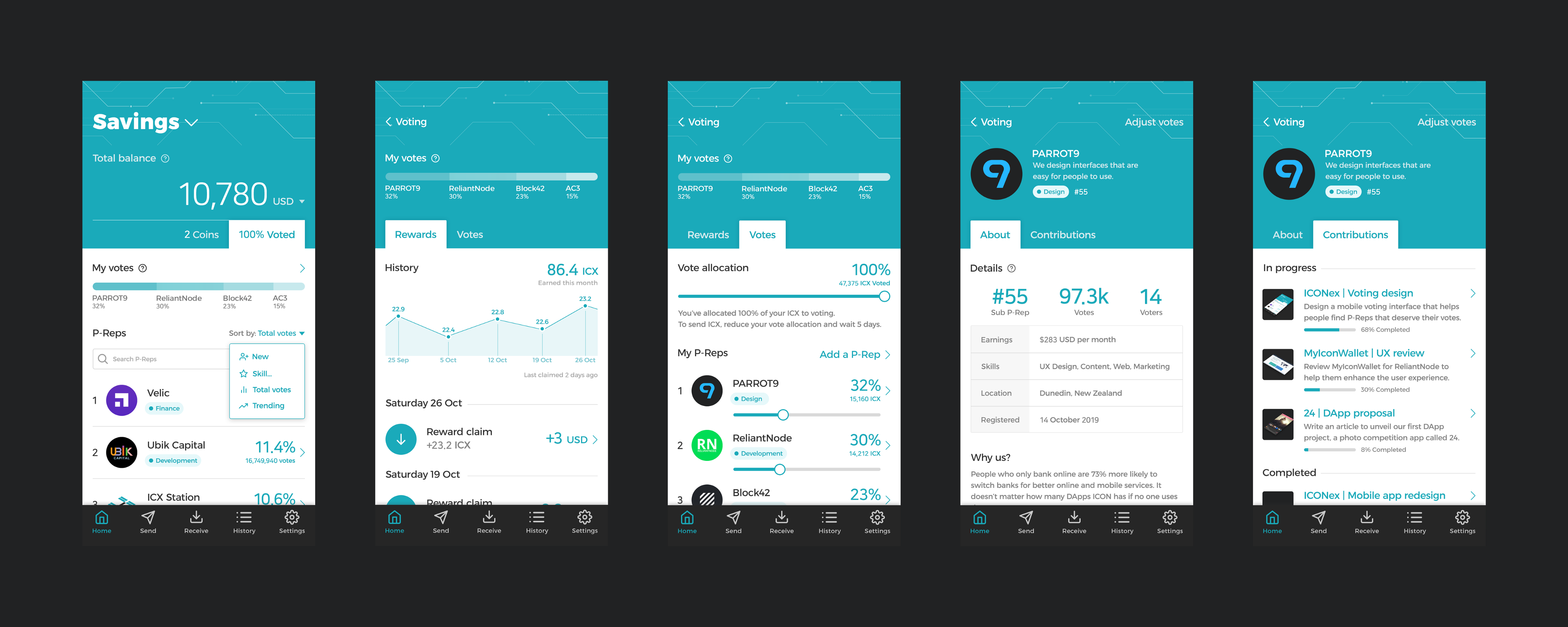
Five ICONex mobile screens showing representative listings, voting rewards, vote-allocation sliders, a team profile, and project progress.

A voting system that reduces apathy

Voter apathy affects every governance system, even in crypto. ICON paid contributors through voting rewards, but people rarely voted outside the top 3. We made it easy to see what each team was working on and what they’d already contributed, so you could support the people who deserved it most.

View the ICONex voting design

ICONex wallet redesign.

A crypto wallet that’s easy to use

ICON’s official wallet was almost impossible to use. Our design evolution enhanced the foundations, made it easy for the average person to understand, and added multi-chain handling so it could scale to support ICON’s cross-chain mission.

View the ICONex wallet redesign

Omm

  • App design
  • Web design
  • Branding
  • Marketing
  • Documentation

Omm was a money market designed as a simple alternative to the industry leaders. It pivoted to liquid staking in 2023 before it retired in 2025.

UX design is the absolute best out there, easy to use and understand.

— Pete Young
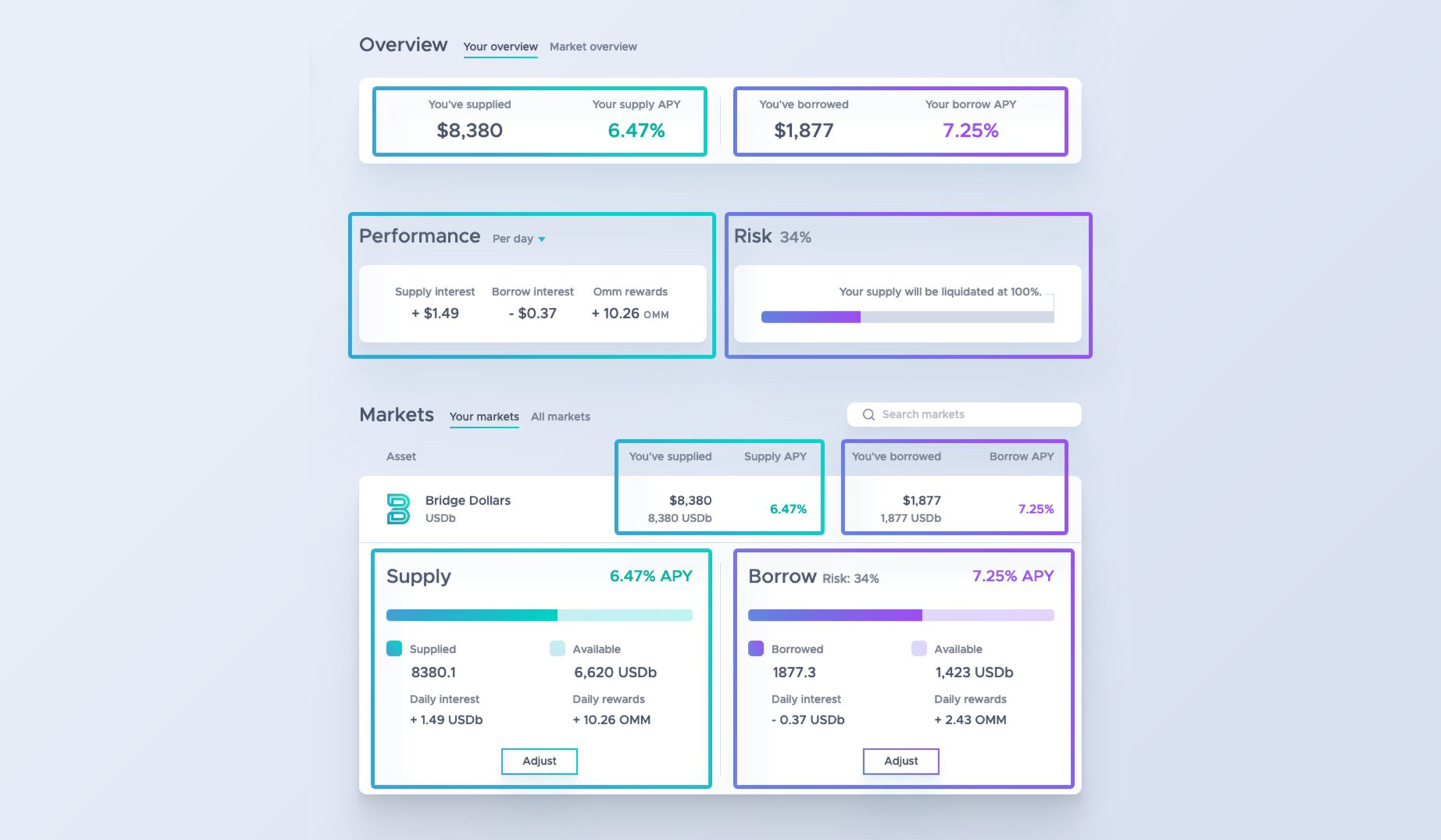
Omm interface with green outlines and controls highlighting supplied funds and purple outlines and controls highlighting borrowing and liquidation risk.

An interface that guides people with colour

People fumble their way through software and click buttons they don’t read. You could lend and borrow through Omm, but one is riskier than the other. To distinguish between them, we made actions and information green for lending and purple for borrowing — a decision that defined Omm’s brand identity.

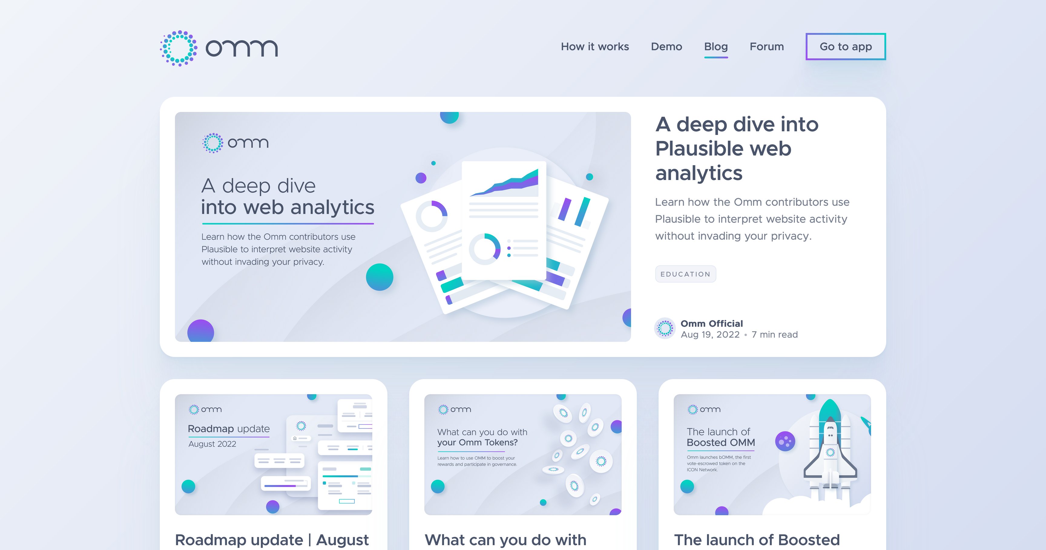
Omm blog with a featured analytics article above three article cards, using matching pale backgrounds and green-and-purple illustrations.

A blog with a consistent brand style

People are more likely to read and trust information that looks aesthetic, so we made the Omm blog as pleasing to look at as the app and website. Blog images often dilute a brand, but our consistent use of colour and bespoke illustrations made Omm’s brand cohesion impressive to behold at scale.

A money market that makes sense

Most money markets are rigid, and more complex than they need to be. It’s easy to put your money at risk because you don’t understand the consequences in advance. Informed by our work on Balanced, we designed a money market with a 0-100% risk scale and an interface that helps you learn through action.

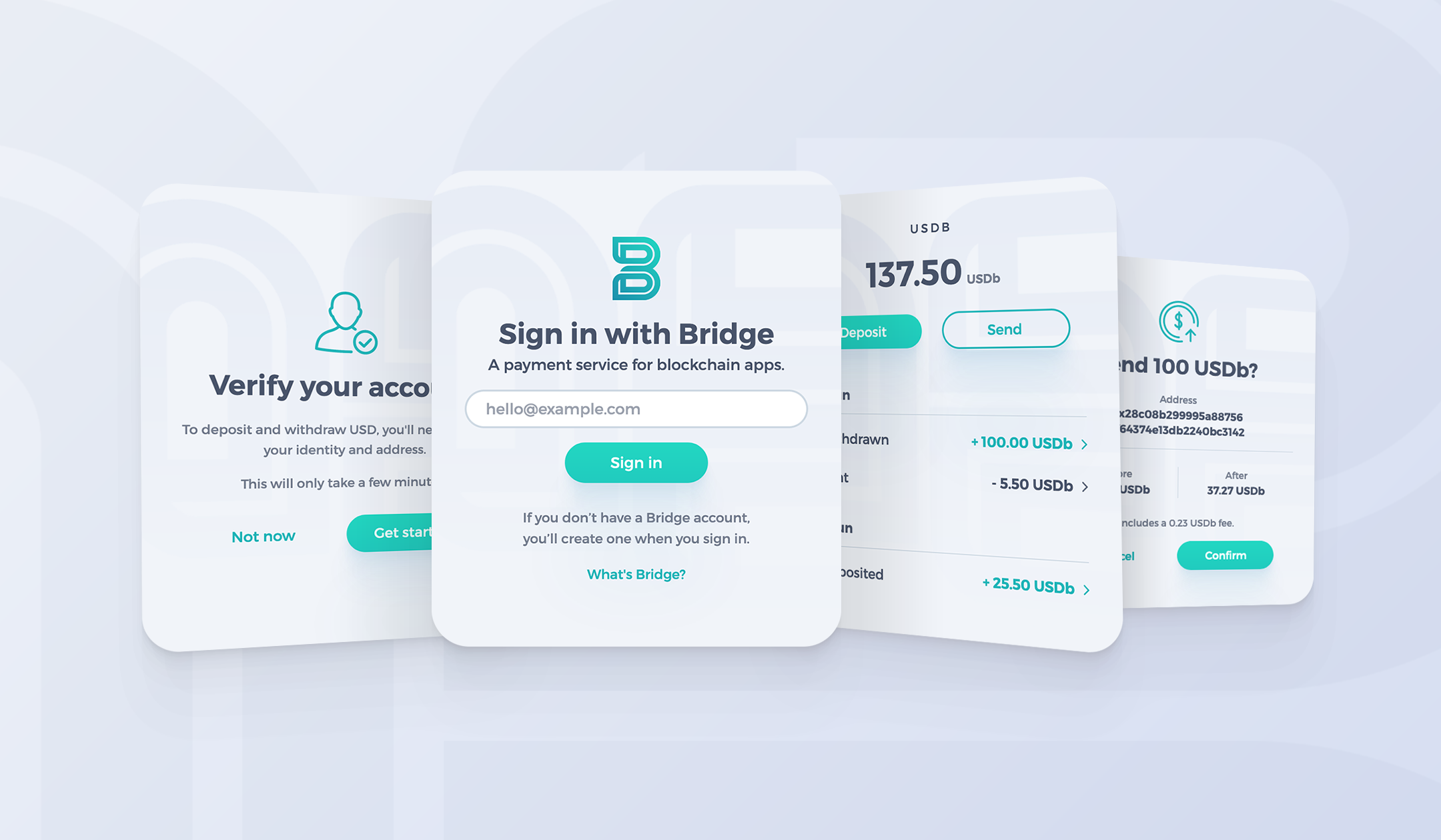
Four overlapping Bridge wallet screens for email sign-in, account verification, balances and payment confirmation, with pale panels and turquoise buttons.

A wallet designed for native integration

People new to crypto need to start at step one: get a wallet and add funds to it. It’s easier to manage an inbox than a private key, so Omm integrated an email wallet service called Bridge. Another PARROT9 project, we designed Bridge with Omm in mind so it would complement the app rather than conflict with it.

Looking for social proof?

See what others have to say about our work.

View our testimonials